49 Best UI Component Libraries Compared: Free vs Paid
Cover supplied by the author. UI cards and numbers in the cover are illustrative graphics, not evidence of real reviews, traffic or product performance.
TL;DR: For most React projects, start by evaluating shadcn/ui or HeroUI; for straightforward Tailwind styling, try daisyUI or HyperUI. Add a specialist such as Motion Primitives for animation, Tailark for marketing sections, or Tremor for dashboards when your project needs it. The comparison below covers all 49 names in the image, with separate usefulness and cost-value ratings; uncertain identities are marked rather than given invented scores.
Research checked in September 2026. Prices are in US dollars where explicitly shown by the vendor.
You have a website to finish. The hero needs work, the pricing section feels flat, and the mobile menu still needs attention. Then someone shares a list of “50 free component libraries.” Suddenly, you have another job: working out which ones are actually worth opening.
This guide compares 49 UI component libraries and related resources, including free React components, Tailwind CSS UI libraries, shadcn/ui extensions, animated website blocks and dashboard kits. It looks at what each resource helps you build, what you can get without paying, and where the trade-offs appear.
There is one small correction to the image: it contains 49 named entries; number 50 is blank. Some names are abbreviated, misspelled or partly hidden by the video controls. Identifiable names have been expanded below. Where several projects could fit, the uncertainty stays visible.
What is a UI component library?
A UI component library is a collection of reusable interface elements, such as buttons, forms, navigation menus and dialogs, that developers use to build websites and applications.
The image also includes block collections, animation toolkits, template shops and a community marketplace. Their purposes overlap, but they are different buying decisions.
A component helps you build a working input or dropdown. A block gives you a larger section, such as a pricing table. A template supplies a whole starting design. An animation toolkit adds movement and feedback.
That distinction matters when you are choosing your first library. An animated background may improve a launch page, while a dependable form system can save work throughout an application.
How the stars work
These are editorial ratings based on official documentation, available examples, integration approach and published access terms. They are not results from hands-on testing of every library, performance benchmarks or accessibility audits.
Usefulness means practical fit for a typical web project: everyday coverage, integration clarity and how much relevant work the resource can reasonably save. Cost-value means how much usable UI you get for the money, including the strength of the free offering and the clarity of paid access.
| Rating | Usefulness | Cost-value |
|---|---|---|
| ★★★★★ | Excellent first shortlist for its stated job | Substantial usable UI at no cost |
| ★★★★☆ | Strong option with some setup or scope limits | Good free offering or sensible optional upgrades |
| ★★★☆☆ | Helpful for a particular style or workflow | Value depends heavily on the exact asset you need |
| ★★☆☆☆ | Limited fit for a typical new project | Significant limitations for the available evidence |
| Not rated | Identity or documentation could not be confirmed | Price or usage terms could not be established |
A three-star specialist can still be the perfect choice for your project. For example, 8bitcn makes much more sense for a retro game website than for an accounting dashboard. Read the “best use” column before comparing stars.
Cost key: “$0 core” refers to the usable free components, not hosting, development labour, an AI subscription or the entire vendor catalogue. “Paid extras; amount unverified” means a paid offering exists, but this research could not establish a reliable current checkout price.
What are the best free React and Tailwind UI component libraries?
For a custom React application, shadcn/ui and HeroUI are strong starting points. For Tailwind website sections, HyperUI and Float UI offer useful free collections. For specialised work, evaluate Tremor for dashboards and Motion Primitives for animation. The best choice depends on your framework, required behaviour and maintenance budget.
For readers who would rather start building than open 49 tabs, these are the most practical starting points.
| Your project | First resource to evaluate | Why it earns a place |
|---|---|---|
| Custom React application | shadcn/ui (ui.shadcn.com/docs) |
Editable component source and a large registry ecosystem |
| React app needing styled defaults | HeroUI (heroui.com/en/docs/react/getting-started) |
A packaged library with React Aria behaviour and Tailwind styling |
| Tailwind project with simpler class names | daisyUI (daisyui.com/) |
Semantic styling classes and themes |
| Business website on a tight budget | HyperUI (www.hyperui.dev/) |
Free Tailwind sections across common website needs |
| SaaS marketing website | Tailark (tailark.com/) |
Marketing blocks designed around shadcn and Next.js |
| Small, purposeful animations | Motion Primitives (motion-primitives.com/) |
Copyable motion components with a focused purpose |
| Visually expressive portfolio | React Bits (reactbits.dev/) |
A catalogue centred on creative components and effects |
| Analytics dashboard | Tremor (www.tremor.so/) |
Components specifically for charts, filters and reporting |
| Product with complex interface widgets | Kibo UI (kibo-ui.com/) |
Composable additions to a shadcn-based application |
These recommendations assume the resource fits your framework. An Astro template may be excellent value for an Astro website and create extra conversion work inside an existing Next.js application.
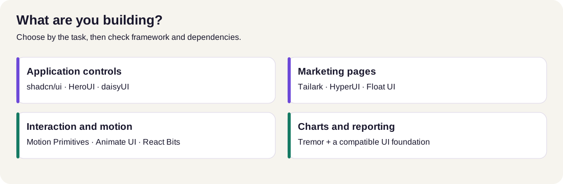
Read the diagram: Start with the work you need to finish. Choose a foundation for forms and controls, a block collection for page sections, or a specialist for motion and reporting. Verify the selected component in your own framework.
UI component library comparison: all 49 rated for usefulness and cost
The original numbering is preserved so you can match every row to the screenshot. Links point to official sites, documentation or project repositories. Some expansions are provisional; those are labelled explicitly.
Entries 1-17: foundations, product components and visual effects
| # | Library | Best use and practical trade-off | Cost / free access | Useful | Cost-value |
|---|---|---|---|---|---|
| 1 | 8bitcn (8bitcn.com/) |
Retro components and blocks. Excellent stylistic fit for playful projects; pixel styling needs to suit the brand. | $0 open-source collection | ★★★☆☆ | ★★★★★ |
| 2 | basecn (basecn.dev/) |
shadcn-style components powered by Base UI. Useful if this primitive choice fits your app; verify usage terms before adopting the collection. | Public component docs; licence/access terms not established | ★★★★☆ | Not rated |
| 3 | beUI (beui.dev/) |
Animated React and Next.js interactions. Strong for adding feedback and movement; requires comfort with Motion and Tailwind. | $0 core; Pro extras, amount unverified | ★★★★☆ | ★★★★☆ |
| 4 | coss ui (coss.com/ui) , likely “COS UI” |
Base UI-based everyday controls, including forms, menus and date inputs. Check that this is the project intended by the image. | Open-source collection; paid scope not established | ★★★★☆ | ★★★★☆ |
| 5 | Cult UI (www.cult-ui.com/docs) |
Motion-rich, niche components for shadcn projects. Useful for distinctive details; expect adaptation to your design system. | Public component source; this assessment covers the public collection | ★★★★☆ | ★★★★☆ |
| 6 | daisyUI (daisyui.com/) |
Tailwind styling with semantic classes and themes. Particularly useful when repeated utility strings slow you down; interactive behaviour still needs implementation. | $0 core; separate commercial assets should be assessed individually | ★★★★★ | ★★★★★ |
| 7 | Easy UI (www.easyui.pro/component) |
React/Tailwind components and larger website starting points. Check the exact component or template you want, since their access differs. | Public component examples; paid templates, exact access varies | ★★★☆☆ | ★★★☆☆ |
| 8 | Eldora UI (eldoraui.site/) |
Animated components and visual effects. A useful source for a chosen treatment; compare its examples with other effect libraries before integrating. | Free, open-source components advertised | ★★★☆☆ | ★★★★☆ |
| 9 | Fancy Components (fancycomponents.dev/) |
Creative React components and microinteractions. Good for an expressive portfolio; everyday app coverage is a different need. | $0 open-source collection | ★★★☆☆ | ★★★★☆ |
| 10 | HeroUI (heroui.com/) |
Styled React controls built with React Aria and Tailwind. A strong application foundation; follow docs matching your installed major version. | $0 open-source web packages | ★★★★★ | ★★★★★ |
| 11 | Kibo UI (kibo-ui.com/) |
Composable shadcn extensions for richer application interfaces. Valuable when a widget matches a real feature; inspect its dependencies. | $0, free and open source | ★★★★★ | ★★★★★ |
| 12 | Magic UI (magicui.design/) |
Animated marketing components and effects. Handy for product launches; use selected effects consistently rather than filling every section with movement. | $0 core; Pro offering, amount unverified | ★★★★☆ | ★★★★☆ |
| 13 | Motion Primitives (motion-primitives.com/) |
Focused motion components for interface polish. A strong animation shortlist; combine with your application's control foundation. | $0 open-source components | ★★★★★ | ★★★★★ |
| 14 | MVP Blocks (mvpblocks.com/) |
Candidate block collection from the image. Official site fetching failed during research, leaving current contents and access unconfirmed. | Unverified | Not rated | Not rated |
| 15 | shadcn/ui (ui.shadcn.com/docs) |
Editable components for a custom design system. Very useful when you want control; your team owns the copied code and its future changes. | $0 open-source component source | ★★★★★ | ★★★★★ |
| 16 | React Bits (reactbits.dev/) |
Creative React effects, text treatments and backgrounds. Strong for visual storytelling; inspect the dependencies of each selected effect. | $0 public collection; Pro extras, amount unverified | ★★★★☆ | ★★★★☆ |
| 17 | Spectrum UI (ui.spectrumhq.in/) |
Animated React blocks and an agent-oriented registry workflow. Relevant to AI-assisted building; source access and commercial terms need checking. | Public previews; current access terms unverified | ★★★☆☆ | Not rated |
The most useful choice in this group depends on your bottleneck. If you keep rebuilding forms and dialogs, evaluate shadcn/ui or HeroUI first. If the application already works and needs more expressive interaction, a focused motion collection becomes more relevant.
Entries 18-34: specialist collections, animation and marketing blocks
| # | Library | Best use and practical trade-off | Cost / free access | Useful | Cost-value |
|---|---|---|---|---|---|
| 18 | Velora UI , identity unresolved | Multiple projects use this name, including velora.dev's repository (github.com/rokyuddin/velora-ui) and Colorlib's Velora (github.com/ColorlibHQ/velora-ui). The image does not identify which one. |
Cannot assign one project's terms to the other | Not rated | Not rated |
| 19 | Watermelon UI (ui.watermelon.sh/) , provisional match |
React components, blocks and page compositions. Useful for seeing sections work together; the image's older name/domain mapping remains unconfirmed. | Official current platform describes itself as free and open source | ★★★☆☆ | ★★★★☆ |
| 20 | 21st.dev (21st.dev/) |
Community component, theme and template discovery. Useful for finding specific designs; review the chosen author's code and terms. | Public discovery; marketplace access, author purchases and AI credits have separate terms | ★★★★☆ | ★★★☆☆ |
| 21 | Aceternity UI (ui.aceternity.com/) |
Expressive React/Tailwind landing-page components. Strong for a visual hero or feature section; complex effects need careful integration. | $0 free components; annual $169 or lifetime $199 displayed | ★★★★☆ | ★★★★☆ |
| 22 | Amicro (github.com/Subhan-code/Amicro--Micro-transitions-) |
React microinteractions and transition patterns. Useful for focused feedback; the repository is the verified source for this entry. | $0 MIT-licensed project source | ★★★☆☆ | ★★★★☆ |
| 23 | Animate UI (animate-ui.com/) |
Animated React primitives, components and icons. Strong for extending an interactive UI; inspect each primitive's API and dependencies. | $0 open-source distribution | ★★★★☆ | ★★★★★ |
| 24 | Beautiful UI (beautifului.dev/) |
AI-interface patterns: streaming answers, approval cards, task rows and context cards. Especially relevant to agent products; working backend behaviour is separate. | Public demos; code licence and paid access not established | ★★★★☆ | Not rated |
| 25 | FlyonUI (flyonui.com/) |
Tailwind components with semantic classes and JavaScript plugins. Useful for conventional sites and apps; plugin setup is part of the work. | $0 open-source core; assess other assets separately | ★★★★☆ | ★★★★★ |
| 26 | Hexter UI | Name visible in the image, but a reliable official project and current docs could not be identified. Avoid substituting an unrelated similarly named library. | Unverified | Not rated | Not rated |
| 27 | JollyUI (www.jollyui.dev/docs) |
React Aria components compatible with shadcn styling. Useful for that specific combination; the root site returned a paused deployment during one check. | $0 open-source project; repository available (github.com/jolbol1/jolly-ui) |
★★★☆☆ | ★★★★☆ |
| 28 | Lightswind UI (lightswind.com/) |
Animated React components and larger blocks. Useful for visual exploration; distinguish open-source components from commercial assets. | $0 open-source components; Pro/Enterprise terms, amounts unverified | ★★★★☆ | ★★★★☆ |
| 29 | Lexington Themes (lexingtonthemes.com/) , provisional “LEX UI” |
Astro/Tailwind website starting points. Stronger fit for an Astro content site than an existing React application. | Paid examples displayed at $79 per theme; free scope unconfirmed | ★★★☆☆ | ★★★☆☆ |
| 30 | Reverse UI (reverseui.com/) |
Detailed animated components and visual concepts. Best considered when a particular design is valuable to you. | Premium lifetime access advertised; price/free scope unverified | ★★★☆☆ | Not rated |
| 31 | Skiper UI (skiper-ui.com/) , provisional “SK… UI” |
Distinctive shadcn-compatible visual components. Helpful for branded interactions; many catalogue entries are premium. | Free selection; Premium $129 one-time | ★★★★☆ | ★★★☆☆ |
| 32 | SmoothUI (smoothui.dev/) |
Animated React components using Motion and Tailwind. Useful for interface polish; match the example's dependencies to your project. | $0 open-source collection | ★★★★☆ | ★★★★★ |
| 33 | Tailark (tailark.com/) |
shadcn/Next.js marketing sections and page designs. Excellent shortlist for a SaaS website; free blocks and full-access assets differ. | Free public blocks; full-access extras, amount unverified | ★★★★★ | ★★★★☆ |
| 34 | Tailgrids (tailgrids.com/pricing) |
Components and blocks spanning application, marketing and dashboard needs. Particularly useful when repeatable page structure matters. | $0 Essentials; All-Access $199, Team $349 one-time displayed | ★★★★☆ | ★★★★☆ |
There is plenty of overlap here. Before choosing between two animation libraries, take one real section from your project and check which example needs fewer changes to its layout, colours and behaviour. A catalogue's size will not tell you that.
Entries 35-49: Tailwind workhorses, application systems and dashboards
| # | Library | Best use and practical trade-off | Cost / free access | Useful | Cost-value |
|---|---|---|---|---|---|
| 35 | UI Layouts (www.ui-layouts.com/) |
Creative components, effects and ready-to-use blocks. Good for exploring a larger visual composition; distinguish the public project from Pro. | $0 open-source project; Pro extras, amount unverified | ★★★★☆ | ★★★★☆ |
| 36 | Flowbite (flowbite.com/docs/getting-started/quickstart/) |
Conventional Tailwind controls with JavaScript behaviour. A practical foundation; use the correct framework-specific integration. | $0 MIT core; Pro assets (flowbite.com/pro/), amount unverified |
★★★★★ | ★★★★☆ |
| 37 | HyperUI (www.hyperui.dev/) |
Free Tailwind snippets for marketing, ecommerce and application layouts. Excellent budget choice; you implement application logic. | $0 MIT collection | ★★★★★ | ★★★★★ |
| 38 | Preline UI (preline.co/) |
Tailwind components, blocks, templates and plugins. Broad practical coverage; check plugin initialization and asset licensing. | $0 core; Pro $249, Team $459 lifetime downloadable access | ★★★★★ | ★★★★☆ |
| 39 | Float UI (floatui.com/) |
Website components and templates with HTML and multiple framework examples. Useful for straightforward pages; tailor snippets to your application's behaviour. | $0, free and open source; sponsorship optional | ★★★★☆ | ★★★★★ |
| 40 | Meraki UI (merakiui.com/) |
Tailwind components with RTL and dark-mode support. Worth shortlisting for relevant language layouts; verify behaviour in your implementation. | Public components; selected templates displayed at $49 | ★★★★☆ | ★★★★☆ |
| 41 | Kokonut UI (kokonutui.com/) , likely “COCONUT UI” |
React/Tailwind components for distinctive interface details. A useful complement to a consistent application foundation. | $0 free, open-source component collection | ★★★★☆ | ★★★★★ |
| 42 | Nex UI , identity unresolved | Several similarly named React projects exist. The image does not establish which is intended; do not assume this means NextUI/HeroUI. | Unverified | Not rated | Not rated |
| 43 | Ninna UI (github.com/ninna-ui/ninna-ui) |
React components with native Tailwind support and CSS-based theming. Worth evaluating for a new design system; confirm required package coverage. | Open-source repository; licence/access scope not fully verified | ★★★★☆ | Not rated |
| 44 | Sera UI (seraui.com/) |
Reusable React/Next.js components with Tailwind and animation examples. A useful supplementary catalogue; adopt examples that fit your existing style. | $0 free, open-source collection | ★★★★☆ | ★★★★★ |
| 45 | ReUI (reui.io/) |
shadcn-oriented application components, data-grid examples and larger blocks. Relevant to admin products; premium block access is separate. | Free components; All-Access extras, amount unverified | ★★★★☆ | ★★★★☆ |
| 46 | SyntaxUI (syntaxui.com/) |
React/Tailwind elements, marketing blocks and effects. Useful for fast section-level work; assess template purchases separately. | $0 public elements; Pro blocks/templates, amount unverified | ★★★☆☆ | ★★★★☆ |
| 47 | Opensource UI (opensourceui.in/) , likely match |
React/Next.js components, device mockups and presentation widgets. Particularly useful for product showcases; confirm this is the image's intended project. | $0 MIT, personal and commercial use | ★★★☆☆ | ★★★★★ |
| 48 | Kimia UI (kimia-ui.vercel.app/) |
Copyable React controls built for Tailwind CSS 3. Useful for a matching older stack; allow for adaptation in a Tailwind 4 project. | Public copy-paste source; licence terms not established | ★★★☆☆ | Not rated |
| 49 | Tremor (www.tremor.so/) |
React dashboard components, charts, filters and data displays. Excellent specialist shortlist; the chart UI still needs your data integration. | $0 open-source components; premium blocks/templates separate | ★★★★★ | ★★★★☆ |
Unrated entries are research gaps, not bad reviews. A fetching failure can come from bot protection or an unavailable domain. It does not prove a project is abandoned. For Hexter, Velora and Nex UI, the creator's original links are needed to make a dependable comparison of the intended projects.
When is paying for a library worth it?
Pay when the paid asset solves work you actually have scheduled. A relevant multi-page template can be worthwhile if its framework, structure and design already suit the project. A bundle becomes harder to justify when you only want one small effect.
These are the clearest prices established from official pages during this research:
| Resource | Published paid access checked | What to understand before buying |
|---|---|---|
Aceternity UI (ui.aceternity.com/pricing) |
Annual $169; lifetime $199; team $1,590 displayed | Annual renews; lifetime is a one-time purchase. Displayed amounts appear alongside higher reference prices. |
Skiper UI (skiper-ui.com/pricing) |
Premium $129 one-time | The $549 Exclusive offering was marked “Coming Soon”; do not treat it as currently available. |
Tailgrids (tailgrids.com/pricing) |
Individual All-Access $199; team $349 one-time displayed | User limits differ. Promotional reference prices and a launch coupon also appear on the page. |
Preline (preline.co/pricing/) |
Pro $249; Team $459 | Lifetime downloadable assets and hosted MCP access have different terms; included MCP access ends January 1, 2027, after which a subscription is required. |
Lexington Themes (lexingtonthemes.com/) |
Several individual themes displayed at $79 | This is an Astro template purchase; assess any bundle independently. |
Meraki UI (merakiui.com/) |
Stellar and Gray Showcase templates displayed at $49 | Those template prices do not establish a price for every Meraki asset. |
Prices and promotions can change. Use these figures to shortlist, then check the current licence, seat count, billing period and checkout total. Where a reliable price could not be extracted, the comparison says so.
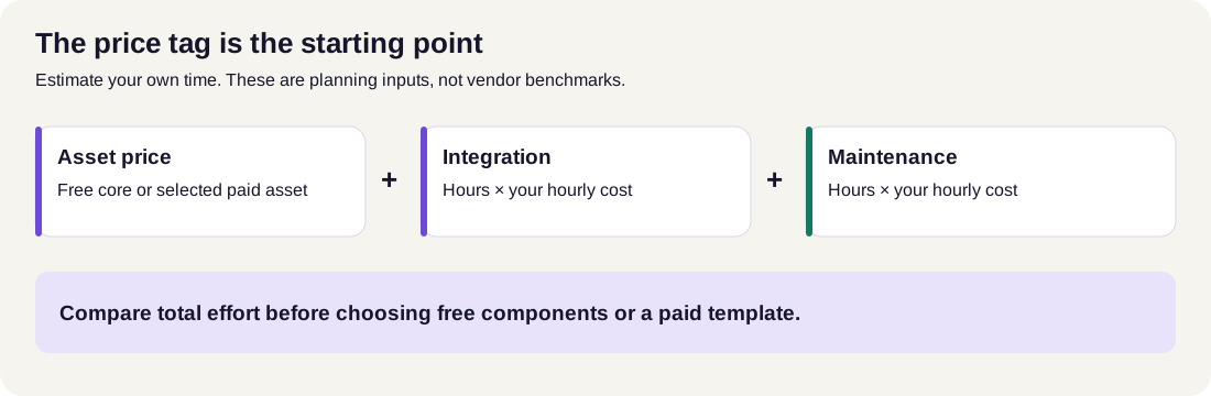
Read the diagram: Include the asset price, integration effort and maintenance effort in your estimate. Free source has a zero purchase price; your implementation time is still part of the decision.
A simple value calculation
Suppose a $129 asset saves four hours and your internal development cost is $40 an hour. That represents $160 of time, leaving a potential $31 saving. This is an illustrative calculation, not a claim about how long any library will save you.
Include adaptation in the estimate. If the same asset requires another five hours to fit your brand and dependencies, it may be poor value for this particular job.
Your real cost is purchase price + integration time + ongoing maintenance. A free library can be excellent value, but copied components still need someone to maintain them.
How do you choose UI components for Next.js, SEO and AI search?
Start with one consistent foundation, then add a specialist for a clearly defined need. Shared typography, spacing, focus styles and colours make the result feel like one product.
For a business website
Evaluate HyperUI or Float UI for familiar sections: services, testimonials, contact forms and calls to action. Add an effect only if it helps explain the offer or guide attention. Spend time on readable copy and a clear next step.
For a SaaS website and application
Evaluate shadcn/ui for the app, Tailark for the marketing pages, and Motion Primitives for selected interactions. Check compatibility between the exact components chosen, especially where registries use different underlying primitives.
For RankNexus, that could mean a consistent tool form, clear progress feedback and readable result cards. A good component helps users understand what to enter, what is happening and what to do with the result.
What is the difference between shadcn/ui and a packaged React UI library?
shadcn/ui distributes component source that you add to your project and customise. A packaged library such as HeroUI supplies reusable components through installed packages. Both can support a design system; the main decision is whether your team prefers owning component source or following a package's APIs and upgrade path.
Which UI component libraries should you evaluate for Next.js?
Start by evaluating shadcn/ui or HeroUI for application controls, Tailark for marketing sections and a focused motion collection for animation. Next.js compatibility should be checked against the exact component, dependencies and installed versions. Marketing claims alone cannot establish that a copied example will work in your application.
Which Tailwind CSS UI library is better for a simple website?
HyperUI and Float UI are practical options when you want copyable sections. daisyUI suits developers who prefer semantic styling classes. FlyonUI and Preline are worth evaluating when you need their JavaScript plugins. Choose by the behaviour your page requires and the setup your team can maintain.
Do UI component libraries improve SEO or Core Web Vitals?
A UI library can support a good implementation, but installing one does not establish better rankings or performance. Evaluate the finished page: readable content, working links, responsive layouts and measured loading, interaction and layout stability. Heavy effects or poorly integrated components can create additional work.
For the performance measurements, use RankNexus's Core Web Vitals Checker on a publicly accessible page. LCP, INP and CLS cover loading, responsiveness and visual stability; Google's Web Vitals guidance (web.dev/articles/vitals) explains the metrics. Test a representative page after integrating components, rather than assuming a library's demo reflects your site's performance.
How do SEO, AEO and GEO apply to a website built with UI components?
SEO helps search engines discover and understand your pages. AEO, or answer engine optimisation, focuses on answering users' questions clearly. GEO, or generative engine optimisation, focuses on making content useful as a source for AI-generated answers. These practices overlap around accessible, reliable and well-organised information.
The useful connection to component choice is what the finished interface lets readers and crawlers access. Clear headings, descriptive links, visible answers and readable comparison tables help communicate the page's purpose. A decorative component has less value if it obscures the information visitors came for.
Google says its existing SEO best practices apply to AI Overviews and AI Mode, with no separate special optimisation required. There is no component library that guarantees inclusion or citation. See Google's guidance on websites and AI search features (developers.google.com/search/docs/appearance/ai-features).
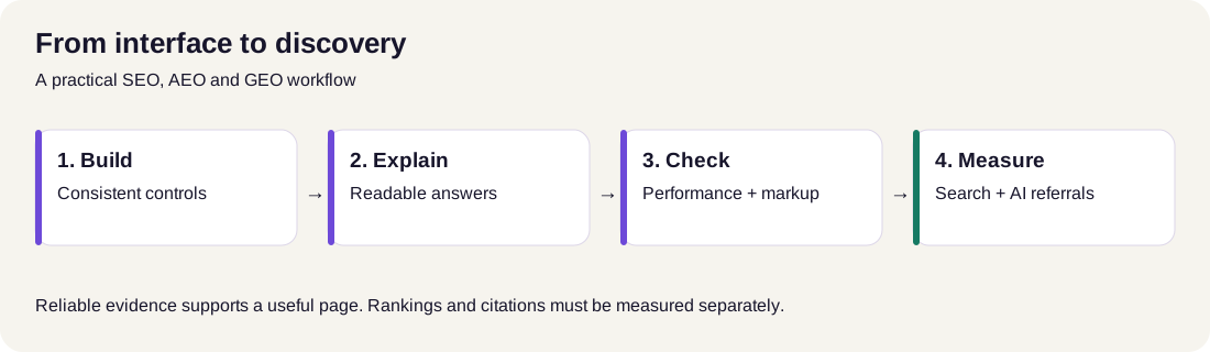
Read the diagram: Build consistent controls, publish clear answers, check the finished page, then measure search discovery and actual AI referrals or citations. A readiness check describes signals; observed visibility describes results.
How can you make a comparison page easier to use as an AI-search source?
Give readers a direct answer, define how the comparison was made, and attach sources to specific claims. Keep each recommendation clear about its task, framework and limitations. Label uncertain identities, promotional prices and editorial ratings so those details remain understandable when a passage is read on its own.
Use RankNexus's Helpful Content Review to examine the published page's explanation and evidence. Its feedback is a review of the content, rather than a Google ranking score.
For a broader review, RankNexus's GEO Readiness Checker inspects page and site signals. Its readiness score is a RankNexus diagnostic; it does not measure whether an AI engine has cited the page. The AEO and GEO audit checklist offers a related workflow for reviewing content, crawlability and measurement.
Does a comparison article need structured data?
BlogPosting or Article structured data can describe an article's headline, author, dates and image. Markup should match the published page. Google explains its role in Article structured-data documentation (developers.google.com/search/docs/appearance/structured-data/article). Keep the visible questions and answers useful even when a search engine does not display a special result.
After publication, inspect the page's markup with RankNexus's Structured Data and Schema Checker. The stars in this guide are editorial assessments; they should not be presented as customer aggregate ratings.
For an analytics dashboard
Evaluate Tremor for data displays and a compatible component foundation for navigation and forms. Add Kibo UI only when a specific richer widget is required. Your data, permissions, loading states and empty states still need implementation.
A practical evaluation you can do before committing
Pick a representative component: a form with an error state, a dialog or a mobile menu. Put real copy into it, apply your colours, and try the keyboard flow. Check small screens, loading and empty states, and any animation's reduced-motion behaviour.
Record the required dependencies and the changes you made. You will learn more from that small trial than from scrolling through dozens of impressive demos.
Common mistakes that add unnecessary work
Choosing from appearance alone. Look beyond the screenshot to the source, setup instructions and states your users will encounter.
Assuming all free examples have the same licence. Free access, open-source licensing and permission to redistribute paid assets are separate questions. This matters especially when selling templates or building a component generator.
Mixing too many foundations. Several libraries can introduce competing APIs and styling conventions. Add each dependency because it solves a specific problem.
Treating a demo as a complete feature. An AI approval card needs real approval handling. A chart needs real data. A beautiful form needs validation and submission behaviour.
Buying everything upfront. Build a representative page first. You can make a much better purchase decision once you know which work remains difficult.
Your first step can be small: choose one foundation, build one real page, and keep a note of what still takes too much work. That gives you a concrete reason to open the next library,or buy a particular asset.
Frequently asked questions
Which free UI component library is best for a React application?
shadcn/ui and HeroUI are strong starting points. shadcn/ui suits teams that want editable component source; HeroUI suits teams wanting a packaged library with styled defaults. Choose after trying a representative form or dialog in your own project.
Are all 49 libraries in the image completely free?
No. Several provide free components alongside paid blocks, templates or services. Some identities and access terms remain unverified. Check the exact asset and its licence before assuming the whole catalogue is free for your intended use.
Which library should I use for an animated landing page?
Magic UI, Aceternity UI and React Bits are useful starting points for expressive landing-page effects. Motion Primitives is worth considering for focused interface motion. Choose an example that fits your framework and preserves readable content and usable controls.
Can I use components from several libraries together?
Yes, provided their dependencies and underlying APIs are compatible. Keep a consistent design system and add specialists for specific needs. Check component names, styling tokens, primitive versions and motion dependencies before integrating copied source.
Is a paid template worth it for a small business website?
A paid template can be worthwhile when its design, framework and pages closely match the brief. Estimate the purchase cost and adaptation time together. A free block collection may offer better value when your page structure is simple or highly customised.
Want this done for your site?
Run a free audit and see exactly what to fix for Google and AI search.